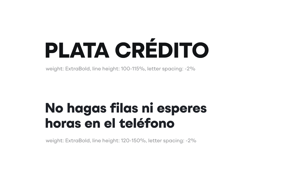
Weight


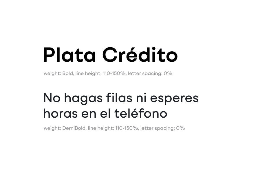
It is recommended to use the standard typeface weights — such as Regular, Medium, and Bold — to maintain visual consistency and ensure optimal legibility across all brand applications.
The Extra Bold, Black, and variable weight values above 720 should be used only in special cases where a heightened level of visual impact is required.
When using these weights, designers must apply letter spacing of –2% to ensure optimal optical alignment


