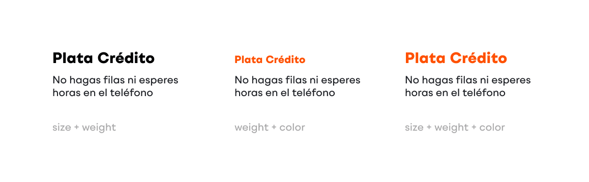
Contrast
When creating advertising materials and design assets, it is essential to apply the principle of text contrast to ensure clarity, hierarchy, and visual accessibility.
We distinguish three primary types of contrast:
1
Size Contrast
Differentiating text elements by scale to establish clear hierarchy.
2
Weight Contrast
Using varying font weights to emphasize key messages and structure content.
3
Color contrast
Applying contrasting colors to enhance readability and draw attention to important elements.
In all design applications, at least two types of contrast must be used simultaneously. This approach guarantees a bold typography system.